

Key Takeaways
Where the "Match Everything" Rule Came From
For much of the mid-twentieth century, home goods were sold in coordinated collections. Bathroom fixture sets, kitchen hardware packs, and bedroom furniture suites all arrived pre-matched, which made decorating simpler - but also reinforced the idea that deviation from the set was a mistake. Retail convenience gradually became perceived wisdom, and the myth that all metals must match took hold.
Today's decorating landscape is different. Homes are assembled gradually, styles overlap, and personal expression is valued over uniformity. Understanding the actual principles at play - contrast, repetition, proportion - frees you to make choices that reflect how you actually live. See the design principles behind rooms that feel good for a fuller picture of what drives visual harmony.
The Myths, Debunked
The following myth-and-fact pairs address the most persistent misconceptions about mixing metal finishes. Each one examines a common belief, corrects the record, and explains the design logic behind what actually works.
Myth
All metal finishes in a room must match, or the space will look chaotic and unplanned.
Fact
Matching all metals is a personal preference, not a design law. Intentional mixing creates depth and character.
This myth likely traces back to an era when matching sets - from the bedroom suite to the bathroom fixture collection - were marketed as the "correct" way to furnish a home. Interior designers, however, have long understood that variety within a framework is what makes a room feel curated rather than catalog-purchased. The critical word is intentional: choosing metals deliberately, with an eye toward balance, produces harmony. Random mixing without a unifying logic is what actually looks chaotic - not mixing itself.
Myth
Warm metals (brass, gold, bronze) and cool metals (chrome, nickel, stainless) can never share a room.
Fact
Warm and cool metals coexist beautifully when one tone is dominant and the other plays a supporting role.
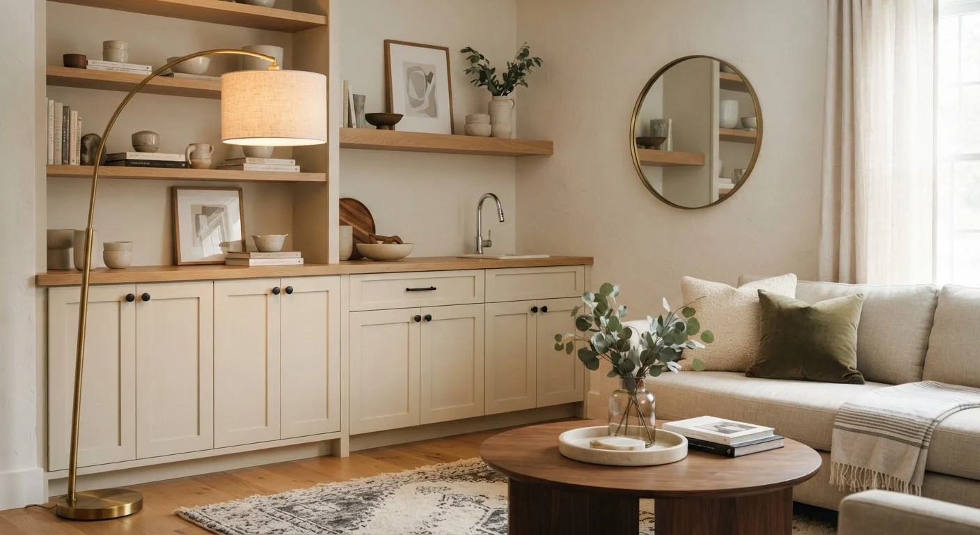
Think of it like mixing warm and cool tones in paint or textiles - contrast is what gives a room visual energy. A brushed brass pendant light over a kitchen island with polished nickel cabinet pulls creates tension in the best possible sense. The trick is proportion: pick a dominant metal (about 60-70% of visible hardware and fixtures) and use the contrasting metal as an accent. This gives the eye a resting point while still delivering interest. As a general guide, rooms that feel flat often suffer from too much sameness, not too much variety.
Myth
Mixing metals is a trend that will quickly look dated.
Fact
The combination of metals has been a staple of traditional, transitional, and contemporary design for decades.
Truly timeless interiors - from Arts and Crafts bungalows to mid-century modern homes - have always incorporated multiple metal finishes. What dates a room is chasing a very specific finish or style that peaks and fades (think: the ubiquitous brushed nickel of the early 2000s used on everything uniformly). A thoughtfully mixed palette actually resists dating precisely because it reflects a personal and layered aesthetic rather than a single moment in commercial design history. When you mix based on your genuine taste rather than what's "in," the result tends to age gracefully.
Myth
You need a professional designer to successfully mix metals.
Fact
A simple framework - one anchor metal, one or two accents - is easy to apply without formal training.
The anchor-and-accent method is straightforward. Start by identifying your anchor metal: the finish that appears most prominently - often on your largest fixtures, like a faucet, light fitting, or door hardware. Then choose one or two accent metals that appear in smaller doses - a cabinet knob, a mirror frame, a side table leg. To test the mix before committing, gather physical swatches or small objects in each finish and lay them side by side in the actual room lighting. Daylight and incandescent light render metal tones very differently, so always evaluate in context. For broader design grounding, see our first-time decorator's guide.
Myth
Every room in the house should use the same metal scheme.
Fact
Metal palettes can and should shift between spaces, as long as there's at least one recurring finish threading the home together.
A home feels cohesive when there is a through-line - a finish or color that recurs often enough to signal intention. But that doesn't mean every room must be identical. Your kitchen might lead with matte black hardware and accent with warm brass, while your bathroom leans toward unlacquered brass with a chrome towel bar. As long as at least one finish (here, brass) reappears throughout, the home reads as unified rather than scattered. For a deeper look at whole-home cohesion, this guide on decorating room-by-room explains how repetition works across spaces.
Practical Starting Points for Your Own Home
Repetition Is the Key to Cohesion
Even the most eclectic metal mix will feel intentional if each finish appears at least twice in a room. One lonely brass knob reads as an accident; a brass lamp paired with brass picture frames reads as a choice. Before adding a new metal tone, ask yourself where it will repeat.
Beyond the anchor-and-accent method, a few practical habits make metal mixing easier in real spaces:
- Start with what you already have. Audit your existing fixtures and hardware before buying anything new. Your current dominant finish may already be your anchor.
- Group metals visually. In open-plan spaces, cluster similar finishes in the same zone rather than scattering them evenly. This creates mini-palettes within the larger room.
- Use finish as a storytelling tool. Aged or unlacquered metals (which develop a patina) suggest warmth and history. Polished or lacquered finishes read as crisper and more contemporary. Mixing both tells a layered story.
- Test in light before committing. Finishes that look compatible in a store can clash under different lighting. Always compare swatches in your actual space at different times of day.
Mixing metals is just one element of a broader layering strategy. If you're interested in how color and texture interact with metal tones, explore how color, pattern, and texture work together for a complementary approach.