

Key Takeaways
Creates depth that photographs and real life reward
Layered rooms have a three-dimensional quality that flat, monochromatic spaces lack. The interplay of matte and sheen, solid and print, light and shadow means the room looks different - and equally interesting - at every time of day.
Expresses personality more than any single element can
A room built on color, pattern, and texture tells a story about the person who made it. Individual choices in each category accumulate into a point of view that generic, safe decorating simply cannot produce.
Hides wear and imperfections more effectively
Patterned surfaces are more forgiving than solids, and textured materials show dirt, scuffs, and fading less readily than smooth ones. A layered room tends to age more gracefully than a spare one.
Makes spaces feel warmer and more livable
Tactile variety - the mix of hard and soft, smooth and nubby - signals that a space is inhabited and welcoming. Rooms with a single surface type can feel clinical or staged even when furnished.
Allows incremental, budget-conscious updates
Because the approach relies on accumulation rather than wholesale replacement, you can add or swap individual elements - a new rug, a set of pillows, a piece of art - without overhauling the whole room.
Harder to execute without a clear organizing principle
Without a shared palette or deliberate scale variation, combining color, pattern, and texture can tip quickly into visual chaos. The approach rewards planning; improvisation without a framework tends to produce cluttered rather than layered results.
Can feel overwhelming in small or low-light spaces
Dense layering in a compact room with limited natural light may make the space feel smaller and heavier. In these contexts, restraint on one element - typically pattern - helps the room breathe.
More costly to get right through trial and error
Patterned textiles and textured materials are harder to return or repurpose than neutral basics. Mistakes in this approach tend to cost more than playing it safe, making planning and sampling especially important.
Risks feeling dated as trends shift
Bold pattern combinations are more susceptible to looking 'of their moment' than quieter palettes. Anchoring the room with durable, quality pieces and using trend-forward patterns only in easily swapped accessories reduces this risk.
Our Verdict
Combining color, pattern, and texture is one of the most rewarding - and most misunderstood - moves in interior design. Done with intention, it produces rooms that feel personal, layered, and alive. The real risk isn't doing too much; it's doing too little and ending up with a space that looks assembled rather than inhabited.
Ideal for homeowners and renters who want rooms that express a distinct point of view and are willing to make deliberate, considered choices rather than defaulting to safe neutrals.
Why Flat Rooms Happen
Most underwhelming interiors share the same root cause: fear. Fear of clashing, fear of overwhelming a space, fear of getting it wrong. The typical response is to strip back - one neutral paint color, minimal pattern, smooth surfaces throughout. The result is a room that photographs cleanly but feels hollow to live in.
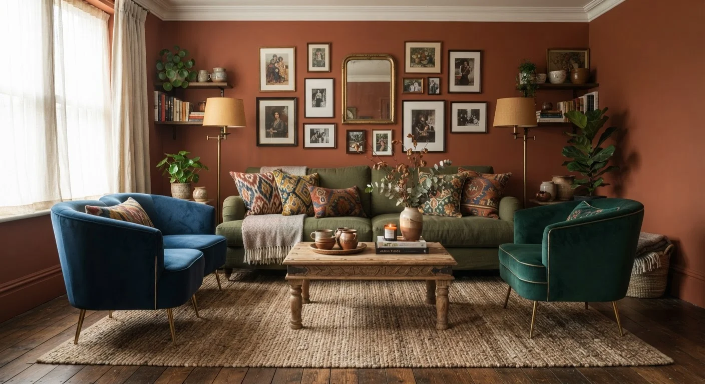
Color, pattern, and texture are not competing forces. They're a system. Each element fills a different sensory role. Color establishes mood and draws the eye. Pattern introduces movement and visual interest. Texture - the roughness of linen, the grain of wood, the pile of a rug - registers as much through touch and shadow as through sight. When one or two of these elements are absent, a room loses a layer of its appeal, even if no one can name exactly why.
Understanding how the three work together is the foundation for making bolder, more confident decorating decisions. For a broader look at how design elements interact, see the core principles behind rooms that feel good.
The Pros: What Layering All Three Achieves
Rooms that successfully combine color, pattern, and texture share a quality that's hard to fake with any single element - they feel considered. Here's what the approach delivers when executed well.
Creates depth that photographs and real life reward
Layered rooms have a three-dimensional quality that flat, monochromatic spaces lack. The interplay of matte and sheen, solid and print, light and shadow means the room looks different - and equally interesting - at every time of day.
Expresses personality more than any single element can
A room built on color, pattern, and texture tells a story about the person who made it. Individual choices in each category accumulate into a point of view that generic, safe decorating simply cannot produce.
Hides wear and imperfections more effectively
Patterned surfaces are more forgiving than solids, and textured materials show dirt, scuffs, and fading less readily than smooth ones. A layered room tends to age more gracefully than a spare one.
Makes spaces feel warmer and more livable
Tactile variety - the mix of hard and soft, smooth and nubby - signals that a space is inhabited and welcoming. Rooms with a single surface type can feel clinical or staged even when furnished.
Allows incremental, budget-conscious updates
Because the approach relies on accumulation rather than wholesale replacement, you can add or swap individual elements - a new rug, a set of pillows, a piece of art - without overhauling the whole room.
Texture, in particular, is worth singling out. Even in a room with a restrained palette and minimal pattern, a linen sofa, a sisal rug, and a rough-hewn wooden table create richness through contrast alone. Learn more about how textiles shape the structure of a room beyond their decorative role.
The Cons: Where the Approach Gets Complicated
Layering all three elements isn't risk-free. There are genuine pitfalls, and understanding them honestly is what separates a curated room from a chaotic one.
Harder to execute without a clear organizing principle
Without a shared palette or deliberate scale variation, combining color, pattern, and texture can tip quickly into visual chaos. The approach rewards planning; improvisation without a framework tends to produce cluttered rather than layered results.
Can feel overwhelming in small or low-light spaces
Dense layering in a compact room with limited natural light may make the space feel smaller and heavier. In these contexts, restraint on one element - typically pattern - helps the room breathe.
More costly to get right through trial and error
Patterned textiles and textured materials are harder to return or repurpose than neutral basics. Mistakes in this approach tend to cost more than playing it safe, making planning and sampling especially important.
Risks feeling dated as trends shift
Bold pattern combinations are more susceptible to looking 'of their moment' than quieter palettes. Anchoring the room with durable, quality pieces and using trend-forward patterns only in easily swapped accessories reduces this risk.
Small rooms deserve special attention here. Adding too many competing elements in a compact space can make it feel crowded rather than rich. The decorating strategies for compact rooms article covers how to apply layering principles without overwhelming limited square footage.
The Rules That Actually Work
The 60-30-10 Color Principle
A practical starting framework divides color in a room into three proportions: roughly 60% dominant (walls, large furniture), 30% secondary (upholstery, curtains), and 10% accent (cushions, art, accessories). This ratio doesn't lock in specific hues - it's a tool for distributing color, pattern, and texture so no single element competes with everything else at equal volume. Adjusting these proportions is also how you shift the room's energy without changing any individual piece.
A few durable principles help keep layered rooms coherent rather than cluttered:
- Anchor with a shared palette. Patterns and textures can vary widely if they pull from the same family of colors. A consistent hue repeated across a patterned cushion, a solid throw, and a painted wall creates visual agreement even when the surfaces differ dramatically.
- Vary scale deliberately. Pair a large-scale pattern - a wide stripe or oversized botanical - with smaller geometric or organic prints. Competing large-scale patterns in the same space create visual noise; differing scales create rhythm.
- Limit dominant patterns to one or two per room. Let one pattern lead, support it with a secondary, and fill the rest with solids and textures. This is the principle behind almost every room that feels layered but not chaotic.
- Use texture as a peacemaker. When colors or patterns feel like they're arguing, adding a textural element - a chunky knit, a hammered metal tray, a basket - introduces a neutral note that bridges the gap.
For rooms that feel disconnected, the issue is often that each element was chosen in isolation. See why rooms decorated independently rarely feel cohesive for a deeper look at how to build visual unity across a home.
Where to Start Without Overcommitting
You don't have to redo an entire room to test these principles. A single vignette - a console table, a reading nook, a bedroom corner - is a low-stakes place to practice layering all three elements before scaling up.
Start by choosing a color you respond to emotionally, not just intellectually. Then introduce a patterned textile - a pillow, a small rug, a piece of art - that contains that color alongside at least one other. Finally, add a textural counterpoint: something matte against something shiny, something rough against something smooth.
Step back and assess. Does the grouping feel alive? Does your eye move around it or land in one place and stop? A successful layered arrangement keeps the eye traveling. If it doesn't, the usual fix isn't subtraction - it's adjusting scale or redistributing color. Understanding how focal points work can help you anchor the composition once the elements are in place.
For readers who want to understand where they sit on the design spectrum before committing to a direction, this visual reference to interior design styles maps the full range from minimalist to maximalist - useful context for deciding how far to push the layering approach.