

Key Takeaways
Design Principles in Interior Spaces
Design principles are the underlying rules - balance, scale, rhythm, emphasis, and contrast - that interior designers use to arrange furnishings, color, and texture so a room feels intentional rather than chaotic. When these principles work together, a space reads as cohesive without necessarily looking 'decorated.' They apply to any style, from spare minimalism to collected maximalism.
These principles originate in visual art theory and have been adapted to three-dimensional space planning. They operate simultaneously, not sequentially - a single furniture arrangement can embody balance, scale, and rhythm at once.
Balance: Stability Without Rigidity
Balance is the distribution of visual weight across a room. It's why a sofa facing a bare wall feels wrong, or why a room loaded with furniture on one side feels like it might tip over. Visual weight comes from size, color darkness, pattern density, and even texture - a large, light-colored piece can weigh the same visually as a smaller, deeply saturated one.
There are two types: symmetrical balance, where identical elements mirror each other (two matching armchairs flanking a fireplace), and asymmetrical balance, where different objects with equivalent visual weight offset each other. Asymmetrical arrangements tend to feel more relaxed and contemporary. A tall floor lamp can balance a low, wide credenza when placed thoughtfully. The goal isn't sameness - it's equilibrium.
Test Balance Before Buying Anything
Before purchasing new furniture or decor, take a photograph of your room and squint at it. Visual weight imbalances show up clearly when the image is slightly blurred - you'll see immediately which side of the room feels heavy and where the eye gets lost. It's a free diagnostic that saves costly mistakes.
Scale and Proportion: Why Things Feel 'Off'
Scale is the relationship between the size of a piece and the space it occupies. Proportion is the size relationship between the pieces themselves. These two issues are behind the majority of rooms that feel somehow wrong even when the colors and style are right.
A dining table that seats eight in a room that fits six reads as crowded; a loveseat floating in a large open-plan living area reads as lost. The fix isn't always replacing furniture - sometimes it's adding a large-scale anchor, like a generously sized area rug, to visually contain the arrangement. Compact rooms face this challenge acutely: furniture that's too small in an attempt to 'save space' often makes the room feel smaller, not larger.
A workable rule of thumb: your sofa should span roughly two-thirds of the dominant wall it faces, and your rug should be large enough that at least the front legs of all major seating sit on it.
Rhythm and Repetition: How the Eye Moves
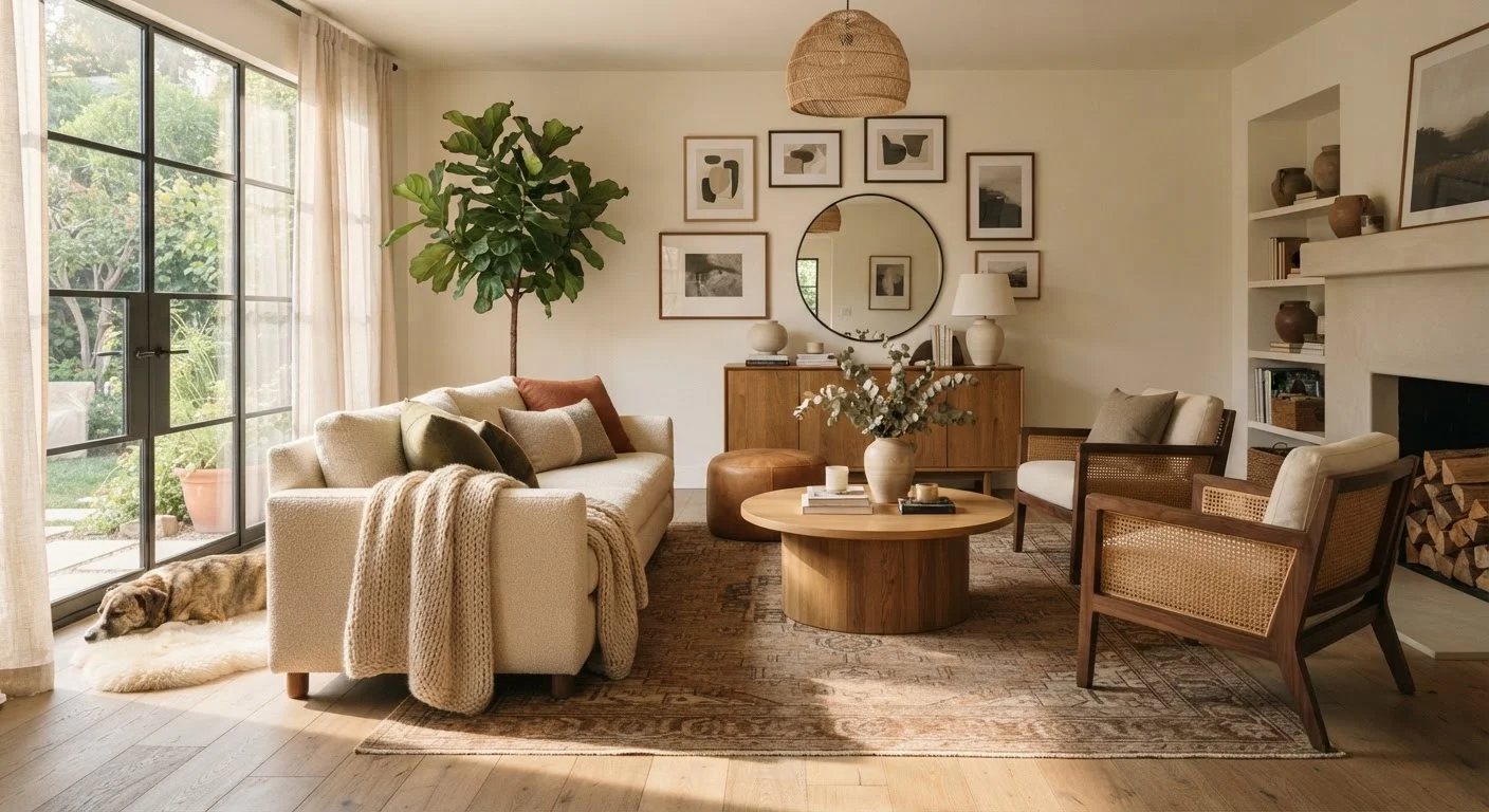
Rhythm in a room is the same concept as rhythm in music - a pattern that repeats with enough variation to stay interesting. In interiors, rhythm is created by repeating a color, shape, material, or motif at intervals throughout the space. A warm terracotta tone appearing in a throw pillow, a pottery vase, and a detail in the rug creates a visual thread the eye follows naturally.
Without rhythm, rooms feel random. With too much - the exact same element everywhere - they feel monotonous. The sweet spot is three to five deliberate repetitions of a key element, varied in size or form each time. Color, pattern, and texture each contribute their own rhythms, and understanding how they interact prevents rooms from reading as flat or chaotic.
Emphasis and Focal Points: Where the Eye Lands First
Every well-designed room has a focal point - a dominant element that catches the eye when you first walk in and anchors the composition. In many rooms, the focal point is architectural: a fireplace, a large window, or an accent wall. When the room lacks a natural focal point, it needs to be created - with a large piece of art, a statement light fixture, or a bold piece of furniture.
The supporting furnishings and decor should orient toward and frame the focal point rather than compete with it. Multiple competing focal points leave a room feeling unsettled. Small-scale updates like paint and trim can significantly reinforce or even create a focal point without structural work.
Contrast: Adding Life Without Chaos
Contrast is what prevents a room from disappearing into itself. It's the interplay between light and dark, rough and smooth, large and small, ornate and plain. Without contrast, even a beautifully curated room reads as flat. Too much contrast - every element competing equally - creates visual noise.
Effective contrast is targeted: a deeply colored throw on a pale linen sofa; one matte-black fixture in a room full of soft, warm finishes; a single graphic print among more muted textiles. Textiles are one of the most versatile tools for introducing contrast - in texture, pattern, and weight - without committing to permanent changes.
These principles don't prescribe a style. A room can be deeply personal, layered with collected objects and bold color, and still be balanced, scaled correctly, rhythmically coherent, and thoughtfully contrasted. The principles are the grammar; your taste is the language. For a broader look at how these ideas connect across a whole home, see our piece on why decorating room by room creates disjointed spaces.