

Key Takeaways
Why Planning Comes First
A gallery wall done well looks effortless. The secret is that the effortlessness is entirely manufactured - through deliberate planning before a single nail touches drywall. Skipping this step is the most common reason gallery walls end up lopsided, overcrowded, or abandoned halfway through.
Think of the wall as a canvas with fixed dimensions. Every frame you add is a design decision that affects the whole composition. Getting those decisions right on paper - or on the floor - costs nothing and saves you from patching unnecessary holes later. If you're still in the early stages of thinking about your room's overall direction, work through a pre-project checklist first to clarify your goals before committing to any single feature.
Gallery walls also function as a room's focal point. Understanding how they anchor a space will help you position them correctly - read more about identifying and framing a focal point before you start collecting frames.
Start With What You Already Own
Before buying new art or frames, audit what's already in your home - prints in closets, mirrors in spare rooms, meaningful postcards or fabric swatches. A gallery wall built from objects you already love tends to feel more personal and cohesive than one assembled purely for aesthetics. Mixing media (framed art, small mirrors, ceramic tiles) also adds texture without significant cost.
Step-by-Step: From Blank Wall to Finished Layout
Follow these steps in order. Each one builds on the last, and rushing ahead typically means backtracking.
Measure the wall and define your boundary
Use a tape measure to record the wall's full width and height. Decide on the footprint your gallery will occupy - for example, centered above a sofa, the arrangement typically shouldn't extend wider than the furniture beneath it. Mark the boundary lightly with painter's tape directly on the wall so you have a visible frame to work within.
Collect and photograph every piece
Lay all candidate frames and art flat on the floor. Photograph the full collection from directly above. This image becomes your reference when planning on paper. Note the exact dimensions of each piece - width and height - so your sketches are proportionally accurate.
Sketch the arrangement to scale
On graph paper, draw the wall boundary to a simple scale (for example, 1 square = 4 inches). Cut out small paper rectangles representing each frame at the same scale and arrange them within the boundary. This low-tech method lets you try many configurations quickly without any commitment. Alternatively, several free digital tools allow you to drag-and-drop virtual frames onto a scaled wall outline.
Transfer the layout to kraft paper templates
Once you're satisfied with the paper sketch, trace each frame onto kraft paper or newspaper and cut the templates out. Write each piece's name or a reference number on its template. Tape the templates to the wall with painter's tape, recreating your planned arrangement exactly. Step back and live with it for a day before drilling anything.
Make final adjustments, then hang
With templates on the wall, you can nudge individual pieces up, down, or sideways until the spacing feels right. Once confirmed, drive nails or picture hooks through the marked hardware locations on each template, then remove the paper and hang the actual frames. Work from the center outward, checking level as you go.
Composition Principles Worth Knowing
A few design principles separate gallery walls that feel considered from those that feel cluttered.
Consistent Spacing
Choose a gap - 2 inches works well for a tight, modern look; 3 inches feels more relaxed - and apply it uniformly between every frame. Inconsistent gaps are the most noticeable sign of an unplanned arrangement.
Visual Weight and Balance
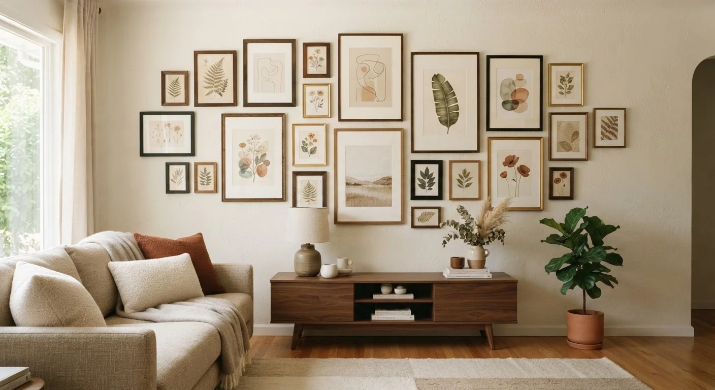
Larger, darker frames carry more visual weight. Distribute them so the arrangement doesn't feel heavier on one side. Balance doesn't require strict symmetry; an asymmetric layout can feel intentional if weight is spread evenly across the composition.
Variety Without Chaos
Mixing frame finishes - matte black, natural wood, brushed brass - adds richness, but limit yourself to two or three finishes across the whole arrangement. The same logic applies to art styles: variety is welcome, but a unifying thread (color palette, subject matter, mood) keeps it cohesive. This principle applies broadly to interior design; cohesion across a whole home follows similar rules.
Scale Relative to the Wall
A gallery wall should fill roughly 60-75% of the available wall width. Too small and it floats awkwardly; too large and it overwhelms. In compact rooms, a tighter grouping of smaller frames often reads better than spreading pieces broadly - see decorating strategies for compact rooms for more on managing visual scale in limited square footage.