

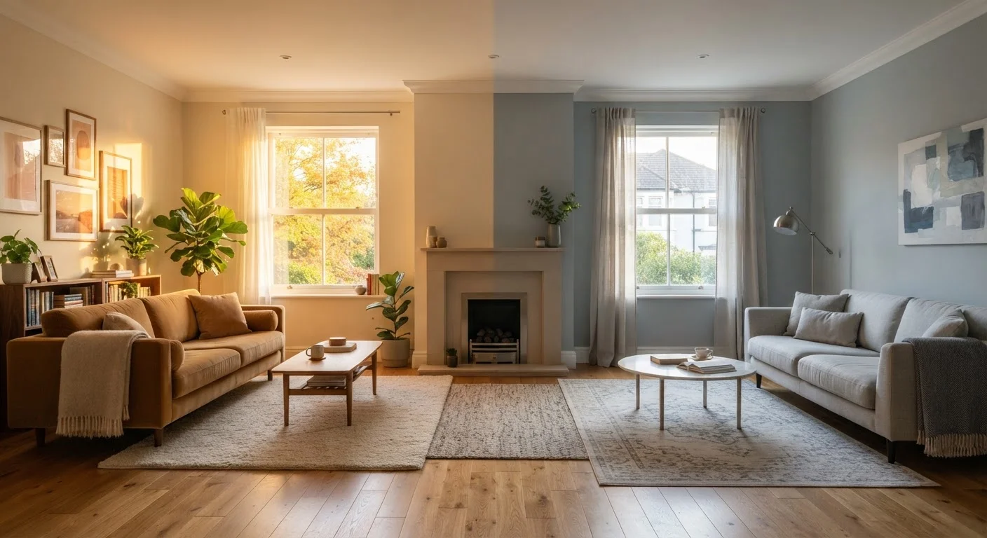
Key Takeaways
Option A
Warm Neutrals
The inviting, grounded choice with earthy undertones.
Best for: Rooms with north-facing windows, spaces you want to feel cozy and enveloping, or homes with wood floors and natural-material furnishings.
Option B
Cool Neutrals
The crisp, airy alternative with blue, grey, or green undertones.
Best for: Bright south- or west-facing rooms, contemporary or minimalist spaces, and interiors where you want a fresh, light-expanding effect.
If your room receives limited natural light or faces north
Warm Neutrals
Warm undertones counteract the flat, blue-grey cast that north-facing rooms tend to hold all day, keeping the space from feeling cold or clinical.
If you want to make a small room feel larger and more open
Cool Neutrals
Cool undertones visually recede from the eye, which creates the perception of more breathing room - especially useful in compact bedrooms or hallways.
If your existing furnishings lean earthy - warm wood tones, terracotta, brass
Warm Neutrals
Matching undertone families prevents undertone clashes, ensuring walls and furnishings feel intentionally coordinated rather than accidentally mismatched.
If your space has abundant southern or western sunlight
Cool Neutrals
Strong, warm sunlight can amplify warm undertones into an orange or yellow cast; a cool neutral provides visual balance and keeps walls looking crisp.
If you want maximum flexibility for future decor changes
Cool Neutrals
Greyed, muted cool neutrals tend to act as more chameleon-like backdrops that accommodate a wider range of accent colors and furniture styles over time.
What Actually Makes a Neutral 'Warm' or 'Cool'
When homeowners describe a paint color as feeling "off" on the wall, the culprit is almost always undertones - the faint secondary hues hiding beneath the surface color. A neutral isn't truly colorless; it's a careful balance of pigments that tips toward either the warm side of the color wheel (red, yellow, orange) or the cool side (blue, green, violet).
Warm neutrals include tones like creamy whites, tawny beiges, sandy tans, and greige (grey-beige blends) with a perceptible hint of yellow or pink. Cool neutrals - soft whites, stone greys, greyed greens, and blue-influenced taupes - lean in the opposite direction. The difference can be subtle when you're looking at a paint chip under store fluorescent lights, but transformative once applied to four walls in your home.
Understanding undertones is one of the core principles behind rooms that feel cohesive - a wall color working against itself reads as restless, even if you can't immediately pinpoint why.
How Light Transforms Undertones Throughout the Day
Light is the single biggest variable in how a neutral reads on your walls - and it changes constantly. North-facing rooms receive indirect, diffused light that skews bluish throughout the day. That same quality amplifies cool undertones into something that can feel cold or stark, while a warm neutral absorbs it graciously and holds its golden character.
South-facing rooms get the most consistent, warm-toned light. A creamy beige in these conditions can tip into a decidedly yellow or orange cast by midafternoon. A cooler neutral balances that incoming warmth, keeping the color from overwhelming the room. East-facing rooms get cool morning light and warmer afternoon light; west-facing rooms reverse that pattern.
Artificial lighting adds another layer. Incandescent and warm LED bulbs (under 3,000K color temperature) will amplify warm undertones and flatten cool ones. Daylight or cool-white bulbs (4,000K-6,500K) do the opposite. If you're relying heavily on artificial lighting - as many living rooms and bedrooms do in the evenings - account for bulb color temperature when choosing your neutral. Our guide on layering light sources explains how different fixture types interact with wall color across a room.
| Criterion | Warm Neutrals | Cool Neutrals |
|---|---|---|
| Undertone family | Yellow, red, orange | Blue, green, violet |
| Best light exposure | North-facing rooms | South- or west-facing rooms |
| Visual effect on space | Advances; feels intimate | Recedes; feels expansive |
| Mood conveyed | Cozy, grounded, enveloping | Crisp, airy, contemporary |
| Works well with | Wood tones, brass, terracotta | Chrome, white oak, slate, navy |
| Risk under warm artificial light | Can read orange or yellow | Stays balanced; holds grey tone |
| Decor flexibility over time | Suits earthy, organic palettes | Adapts to wider accent range |
Reading Your Fixed Elements Before Choosing a Side
Before you test a single swatch, take inventory of the elements you're not changing: flooring, cabinetry, tile, trim, and any large upholstered pieces. These fixed elements already carry their own undertones, and your wall color needs to speak the same tonal language.
Honey-toned oak floors, warm wood cabinets, and brass or bronze hardware are all members of the warm family. Pairing them with a cool grey wall creates undertone conflict - the grey will appear to lean lavender or green, and the wood will look slightly orange by contrast. A warm greige or soft white with yellow undertones brings both into harmony.
Grey-toned tile, white oak or cool-stained flooring, chrome or brushed nickel fixtures, and upholstery in slate or navy all belong to the cool family. Push walls warm in these rooms and the contrast can feel accidental rather than intentional.
Textiles are an easier element to adjust - see how rugs, curtains, and upholstery anchor a room's tonal identity. But flooring and cabinetry are costly to change, which makes them the smarter anchor for your undertone decision.
Testing, Sampling, and Committing with Confidence
Paint chip cards are useful for narrowing the field, but they're unreliable for final decisions. The most effective method: purchase sample pots and paint at least 12-by-12-inch swatches directly onto your wall - ideally in two or three spots to account for corners versus open expanses. Leave them up for a minimum of 48 hours and observe them in morning light, midday light, late afternoon, and under your evening artificial lighting.
Photograph the swatches at different times with your phone's flash off. Camera screens can slightly distort color, but comparing photos side by side reveals how dramatically the same neutral shifts over a full day.
Once you've committed to a direction, remember that paint is one piece of a larger color, pattern, and texture system. A well-chosen neutral wall does its best work as a backdrop that lets layered decor breathe - not as a statement in isolation. And if you're refreshing more than just walls, a targeted approach to paint, tile, and trim together delivers the most cohesive result without a full renovation.
The 'True Neutral' Myth
Paint marketed as a pure, undertone-free neutral rarely behaves that way once applied. Every pigment mixture carries some bias - manufacturers use terms like 'balanced' or 'true greige,' but light will still reveal a lean. Treat every neutral as having an undertone and evaluate accordingly, rather than assuming a 'safe' grey or white will work everywhere.